
Rebuilding Melissa Milloway’s Coffee Cards
I have been rebuilding Melissa Milloway’s Educational Coffee Cards. It’s an Articulate Storyline project that presents information with a bit of flair. The coffee cards have nice little details, especially in the interactions, that give the project a polished user-friendly look.
Emulate the greats
At work I am the only person working on these types of projects so I don’t get to see how other work very often. I enjoy following Melissa Milloway because she works at the intersection of learning experiences, User Experience (UX) design and technology. I think she is on a quest to shed some of elearning’s negative baggage.
Melissa brings a level of attention to detail in graphic design and UX that I wanted to learn from.
I don’t know Melissa Milloway, but I have the impression she is really generous. She shows her work on her website and LinkedIn, as well as providing storyline files for download and tutorials.
*Ok, Fangirl fawning over*
Melissa had written about the Coffee Cards project and shared a storyline file for a similar project, so I could really get under the hood and dig in to her design.
Coffee cards looks simple, but the simplicity comes from a lot of detailed, finessed design: triggers, motion paths, animations, javascript and deft use of the timeline go into this project.
I spent a lot of time as I worked wondering about her workflow. Always a good thing because it made me reflect on mine too!
E-learning development take-aways
-
Melissa makes prototypes of the UI in Adobe XD first. It’s a really good idea. Adobe Xd is free and you can export elements in png at the end.
-
Working on the design outside of Storyline gave me time to focus on colours and graphics in a way I usually don’t. There are a bunch of benefits. First, it is easier to manipulate graphics in Xd than in Storyline. Second, I was focused on the design, instead of what usually happends: tinkering with the look as I work on interactions in Storyline. It saves time in the long run and makes developing in Stroyline less frustrating.
-
In Storyline, the timeline is mostly used to make seamless intros and outros. The timeline is often paused much of the time then restarted by triggers.
-
I usually steer clear of the animation tab. This project showed me that you can make nice things with animation and motion paths, if you use a light hand. The project has fades and motion paths that last .25 seconds. Objects are nudged in hovers by 3px.
-
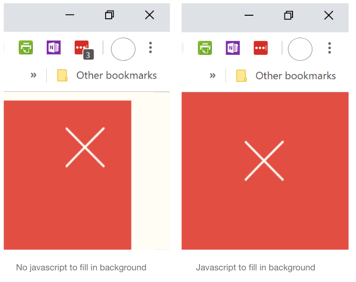
Use javascript to change the background of the page so it looks like it’s in full screen. It’s another example of a small tweak that adds polish to the whole project. I could only get the javascript to work with the classic player.
Here’s my example
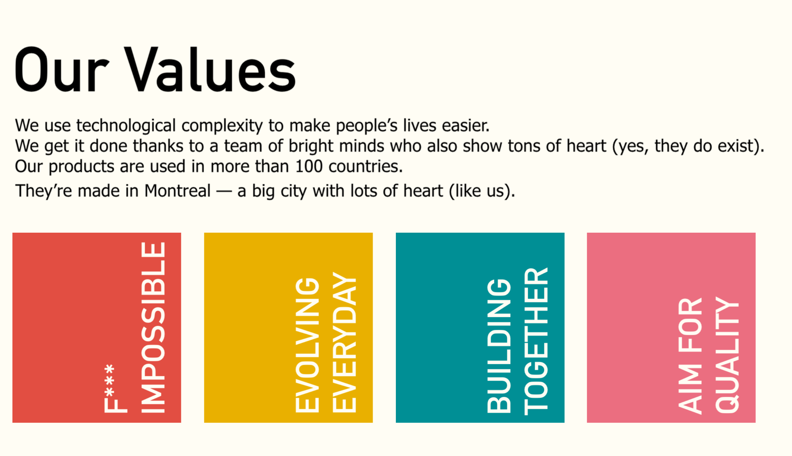
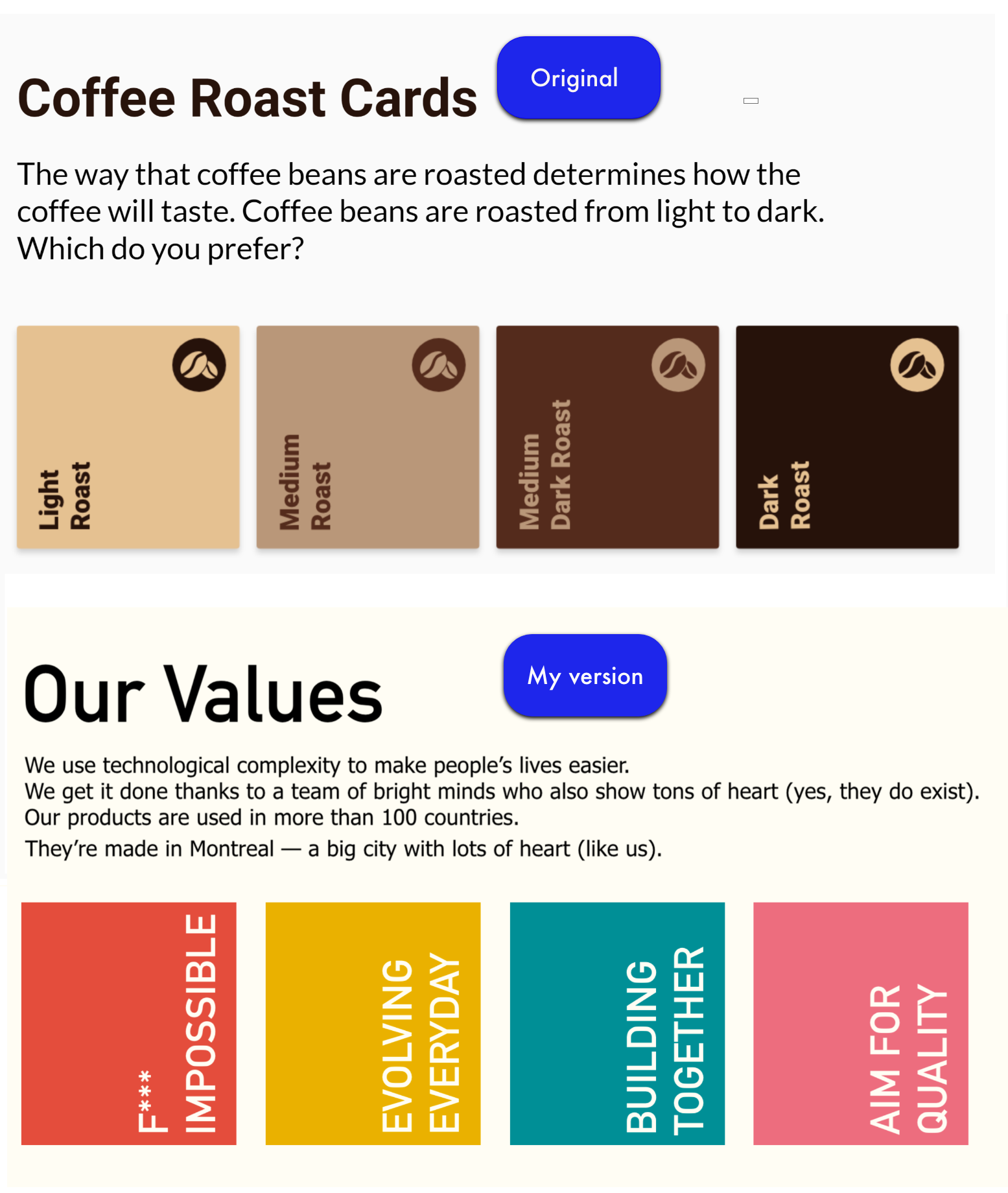
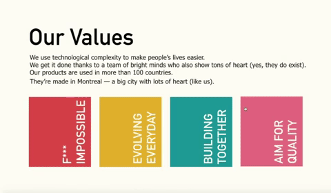
Try my version: Company Values Cards
I used Gsoft’s company values for the cards. It’s Montreal software company that has a unique perspective on work life. I thought it could be an interesting way to show the values for onboarding training.
The color scheme is from Magoz’s website, as highlighted on Canva’s blog. I streamlined the design a bit: removing the icons on the cards and the spin from the close icon.
Cards in elearning
Overall, the cards offer a flexible outline to present chunks of information. It’s an updated version of the tabbed view that is very popular in elearning.
Cards are big in web design because they look good on most devices. I made this in storyline so it is not as responsive as html and css, but it looked pretty good on my smartphone.
Comments