
Cluttered UIs, Screen shots and Documentation
An experiement: 1) Take a screen shot of a cluttered UI; 2) do minimal edits; 3) make it easy for a user to quickly find the discussed feature
When I take screen shots for documentation I often hum and haw over the User Interface.
Am I showing too much? Or too little? Can someone glance at the image and easily situate themselves?
Most of the UIs I work with are pretty cluttered. When I take a picture I worry that the focal point gets lost among all the buttons, options, menus and tabs.
I wanted to do a little study of different approaches to screen shots.
I used Microsoft Excel since it has a packed ribbon and dashboard. It isn’t what I work with normally but I thought a new subject might let me see things in new ways.
I want people to focus on Insert Function, the button that opens the Insert Function Dialog box.
I used Snagit and Snagit Editor for everything.
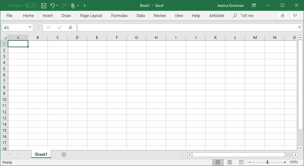
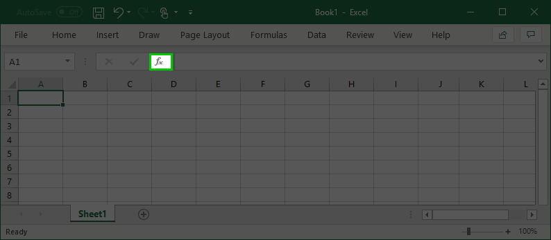
Base image
This is the base image. It’s kind of like a Where’s Waldo at this point.
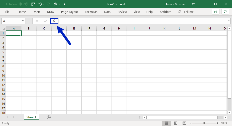
Enter the box and arrow
The box contouring the button and the arrow are a classic screen shot online help strategy.
When I first glance at the image I find there is a lot competing for my attention before I settle on the arrow and box. Then it seems the blue arrow is in competition with the green highlighted box.
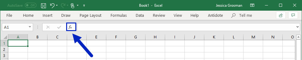
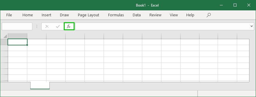
Crop the bottom two-thirds
The next course of action was to crop. I first cropped just the bottom because sometimes users find the close crop too extreme and find it difficult to orient themselves.
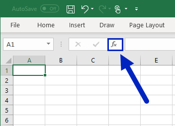
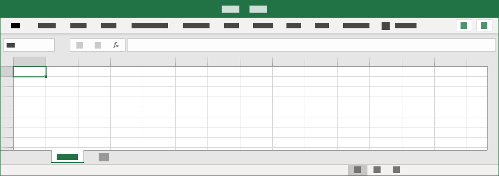
Crop even more! Tighter! Tighter!
I didn’t like the crop above so I went closer and just showed the relevant corner. I like this and it seems pretty obvious where we are in the application. It focuses on the Insert Function button well.
I decided to try some edits that take more time.
Would the extra time and effort be worth it?
Adding contrast by dimming the background
We often use a semi-transparent layer with a cutout to highlight the feature we are talking about. In Snagit it is time-consuming to achieve the effect because I don’t have layers to play with.
What I did was create four semi-transparent black boxes around the Insert Function button. You could also put the grey shape over the whole window and then paste the button on top, now that I think of it. That would probably be even easier.
I like the effect but I think the screen shot would be easier to understand if it was cropped.
Simplified UI
After I tried my hand at a simplified UI. It’s a pretty trendy way to get rid of details in online help topics and on websites. Facebook and Twitter use it when they are loading.
It took a long time to cover all the details with boxes and even longer to decide on colours. I don’t even think I chose the right ones.
It turned into a longish design exercise and the end result is wonky.
Follow my gut, cut, cut, cut
Finally, I just followed my gut and cut out pieces that I found distracting, for example surrounding buttons.
If I was to do it again, I would definitely get rid of that highlighted box, it’s driving me nuts!
Comments